Saturday 20 March 2010

Don't Go Into The Water


The final outcome for the page layout project "Three things you should know about...".
I chose Selachophobia which is the phobia of sharks. To the 'untrained eye' (and I'm not trying to be patronising) this design may look very simple and easy to construct, however, it took 3 weeks and approximately 30 different possibilities to come to this conclusion.
We are taught not to be afraid of space, so I decided to be daring and leave half of the page blank. The activity in the bottom half of the page indicates the sea and a divide between above and below water, because obviously, that is where sharks reside.

I used the silhouette of the shark because the context of the piece is funny and lighthearted. The presence of a real image of a shark would have made the feel more serious like a national geographic magazine. Only half of the shark appears on the layout because this creates an illusion of mystery, and fear; I personally cannot even look at sharks so it made sense for me not to want to expose the shark's entirety. Also I positioned the shark like this because I wanted it to bleed off the page. This imbalance between the shark and the text emphasises the hold of fear it has over me!

Thursday 18 March 2010

Queen of Hearts


These photos are about a month old now but I just found them again and was thinking of wearing my heart tights tomorrow so thought I'd put them up :) Just a casual look that I would wear to uni or for shopping, usually accompanied by either my mulberry satchel or chanel shoulder bag. It was still snowing when these were taken, so now I think it's time to brighten up the wardrobe, especially as I am going home to Dubai in 4 days!


1. My favourite necklace of the moment- Miss Selfridge
2. Heart tights and brogues
3. Ensemble avec French Connection coat :)

Friday 12 March 2010

The Odyssey of the 111


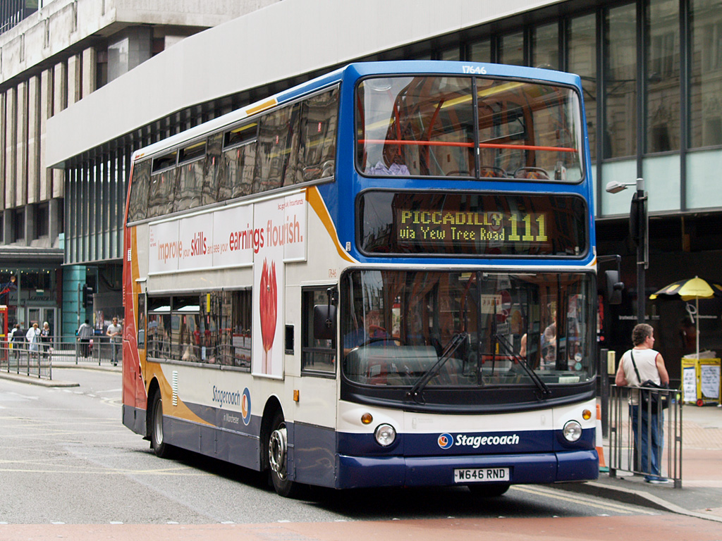
As a twice daily traveler of the 111, the bus that journeys through the backstreets of Manchester, I have experienced many an odd circumstance on my voyages. I was prompted to blog about the phenomenon that is the 111 and its passengers after a string of strange events that occurred this morning on the way home from University.
Perched on the boosted seats downstairs (throne-like and conjure feelings of importance and royalty), I was chatting away to my friend J (yes i watch Gossip Girl) when she leaned over and whispered "Is that lady a man?", looking over towards an OAP I replied "Oh I'm not sure I think it's a man, he's reading the paper" to which J informed me I was pondering over the wrong suspect, the person I was talking about was indeed a man...without a doubt. The actual man in question sitting ahead of us and facing forward was of a very stocky build yet had long, greasy, thin hair died an unnatural shade of brown-orange accompanied by some grey roots, (bang on trend!) As he/she wriggled uncomfortably in their seat I glanced a flash of bright pink lipstick and ghastly blue eyeshadow!
Transvestites/cross dressers are not an uncommon sight in Manchester, Canal Street is the pinacle of the LGBT scene in Britain. But seeing this he/she in the middle of the day, removed from its natural habitat was extraordinary!

Not only do transvestites catch the 111 in full attire at 12 o clock in the afternoon, but if you happen to hop on the bus at 8AM you may be lucky enough to come across Crazy Bus Lady! Pictured above, Crazy Bus Lady, known by the entire Manchester student body, likes to board the buses and preach and rant loudly to passengers. Although her speeches change in content with each sighting, Crazy Bus Lady is far from unintelligent; she strings together sophisticated words (which overall don't make any sense in a sentence) and has a razor sharp tongue for issuing comebacks to anyone who has the guts to argue with her. Such comebacks include "Identify yourself!!"...(I'm the driver, please get off the bus) and "Disgraceful which you are". Although obviously insane, when Crazy Bus Lady speaks there is silence, albeit a few sniggers and the odd abusive comment and her following on facebook grows by the day.

Only a few tales from the Odyssey of the 111, stay tuned for more anecdotes of this wondrous adventure.

Images courtesy of Flickr & the CBL facebook group

Tuesday 9 March 2010

WildHeart


I love, love, looooove the idea of wearing fur with bare legs, so that a sense of animalism is established. It's like skin on skin, if that's not too weird or gross. Although i really like this trend (especially fur paired with denim shorts) it's SO difficult to find an appropriate time to wear it, weather wise. Although my legs don't really get very cold in English weather, walking around in hot pants and a fur coat in winter does look slightly odd. Hence, I'm waiting for that perfect week when it's not hot but not cold to fulfil my fashion desires. For now I will just have to make do with messing around in my centrally heated house.


1. Me (Fur Coat- New Look, Pink Vest & Denim Hot Pants- Topshop, Necklace-ASOS)
2, 3 & 4. Harper's Bazaar Russia, October 2009

Karl Lagerfeld


This morning I decided to wear black leggings, a black topshop tunic/dress and a white long sleeved top underneath. Paired with my black leather jacket, and dark sunglasses (YES, it was gloriously sunny in Manchester this morning!), it wasn't until I stepped out the door and glanced at my reflection in a car window that I thought 'Wow, do I look like Karl Lagerfeld today?!'. Resisting the temptation to run back inside, fetch some black gloves and tie my hair up, I carried on walking to university in the sunshine.

Monday 8 March 2010

Beautiful Things


1. Baboushkas
2. Wall of Collections
3. Birdcage
4. Lampshade Pattern
5. Another View of 'the wall'

I like to surround myself with beautiful things...Due to a misfortune involving straws and chance I inherited the smallest bedroom in our house. However, for what it lacks in size it makes up for in detail. I gave up on the notion that successful interior design had to be matchy-matchy, and decided to bring along only my favourite and most treasured trinkets across the globe to embark upon student life in a different country.

Now my room is a space made up of eclectic and personal artefacts that I have picked up or been given throughout my life. I always look up to 'The Wall' which consists of photographs, postcards, design work, leaflets, magazine pages and just general nonsense. It is a constant reminder of who I am and what I genuinely like.

My baboushkas and my birdcage were both birthday presents, I love how the birdcage doubles up as storage (mainly because I have no space in my pokey little room), and my mum left the £20 price sticker on. I don't want to remove it because it feels like it's part of an antique shop and makes me want to look at every little thing I have in my room as if it were all individually for sale.

Dexter


The brief was to design a logo for a fictional character from a book, film or TV. I love the TV show "Dexter" on Showtime, he is a blood spatter analyst who has an appetite for murder after witnessing the brutal death of his mother as a toddler. I find his character complex and intriguing and thought these characteristics would lend themselves well to the project.

The logo had to include an image, a quote (of the character's) and the character's name. My image is the anatomical drawing of the heart, I chose it mainly because it was appropriate to Dexter's quote " If I had a heart it would be breaking right now", but also, it resembled the human body and it's insides which Dexter is obviously very familiar with.

Because Dexter's character is very unusual I skewed the name and tag line so it was at a quirky angle. I also highlighted the word "organ" in Dexter's last name (Morgan) as I thought it was an intelligent and appropriate reference to the image of the heart. That was rather lucky though.
I couldn't decide between the red and black final designs...?

Alice is Stuck!


Made in a compulsory book binding class, this diamond shape fold out booklet is from my foundation course last year. Once again it isAlice in Wonderland themed, very appropriate considering the film is released on FRIDAY! I'm ridiculously excited.


Yeah so the brief for this project was to cater to the book's format; I had to keep in mind ideas of spilling out, expanding, folds, compartments etc. What first sprung to mind was Alice taking an "EAT ME" tablet whilst in the White Rabbit's house. She grows so big that her arms and legs stick out of the doors and windows!
The square/diamond format is relevant to the shape of a house, and when opened, the folding walls of the book simulate the feeling of Alice growing and inevitably becoming compartmentalised and stuck.

Followers